Waggle is an app-focused review website with which pet owners can be able to find a place where their pets can be welcome and read up the reviews of other pet owners' experiences at the location.
Research:
Having a website and app available on an iPhone or Android phone makes it easier for people to look up a nearby location no matter where they are. When reviews are involved, they have the full decision to put their trust into it or not.
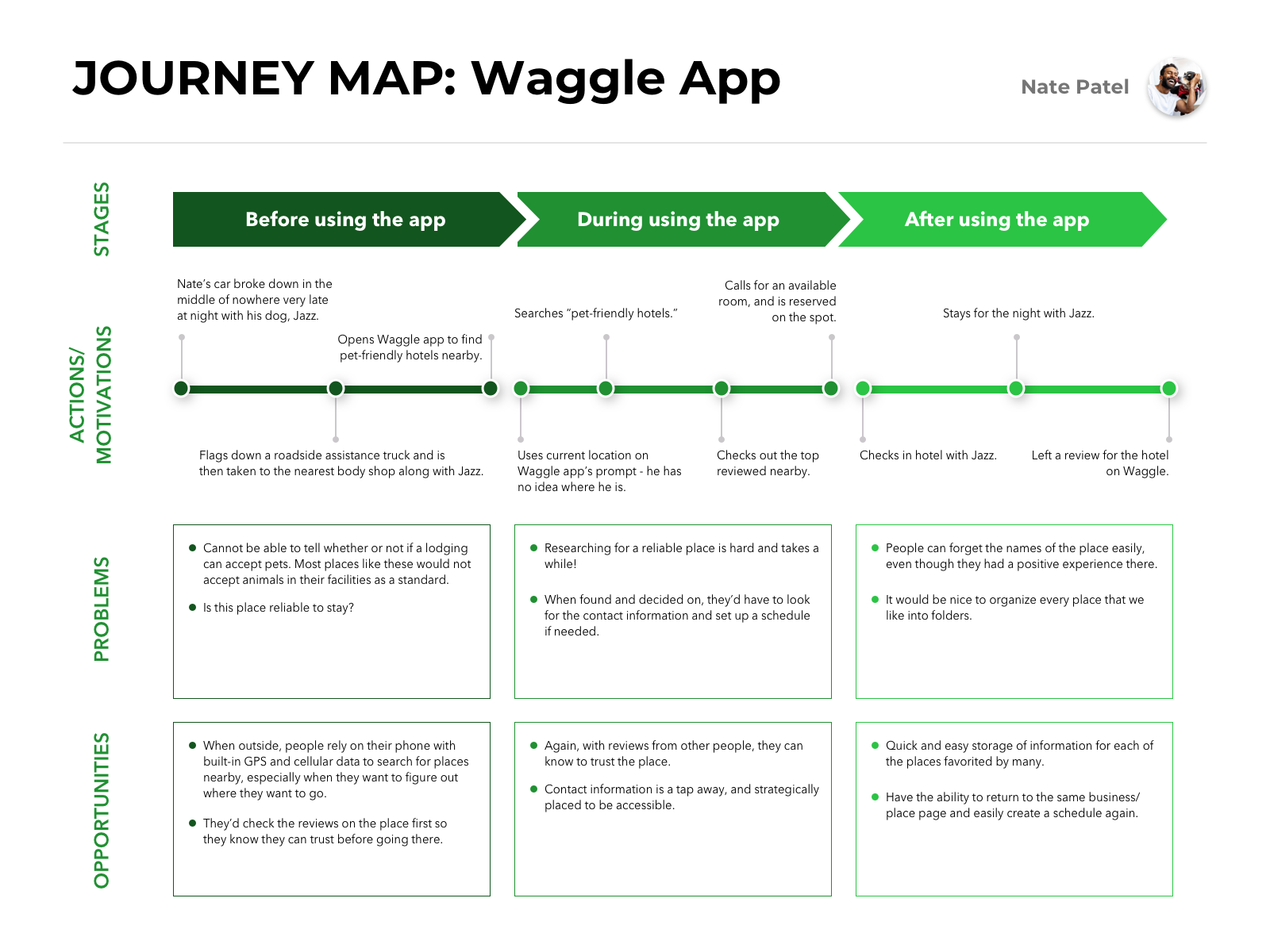
When it comes to pets, people are willing to make decisions that they believe would be best for their four-legged family member. Having easy access to a directory of pet-friendly businesses and parks in their range would be desirable, but can they trust that location? That is when they look up the reviews.
User flow:
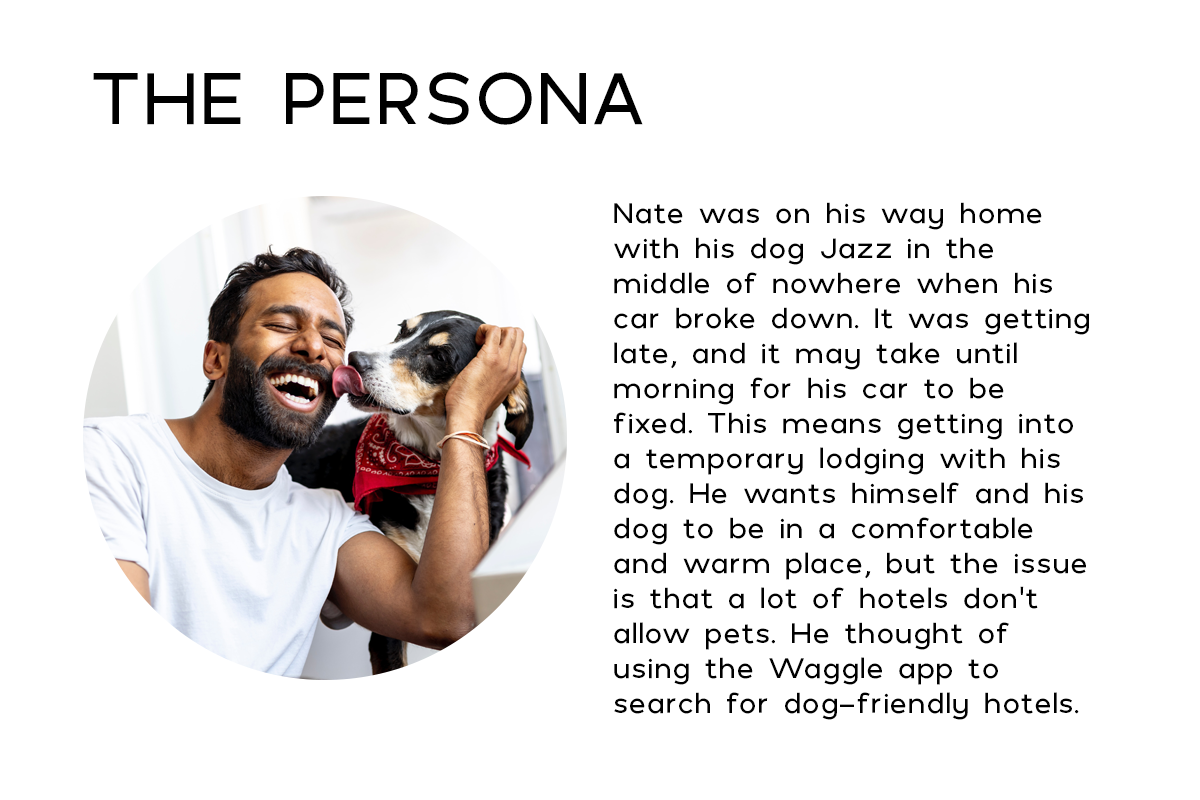
If someone like Nate is in a pinch, the phone would be the first tool to use to find their way out. Especially if they have a dog or cat with them and they'll have to check countless places online that could accept them both.
Ideation:
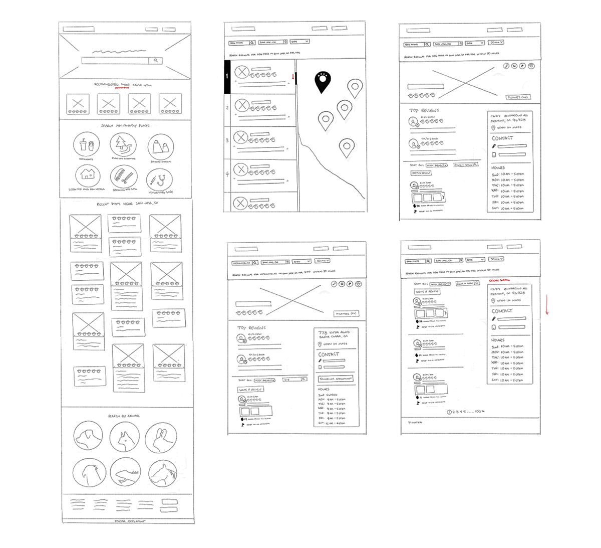
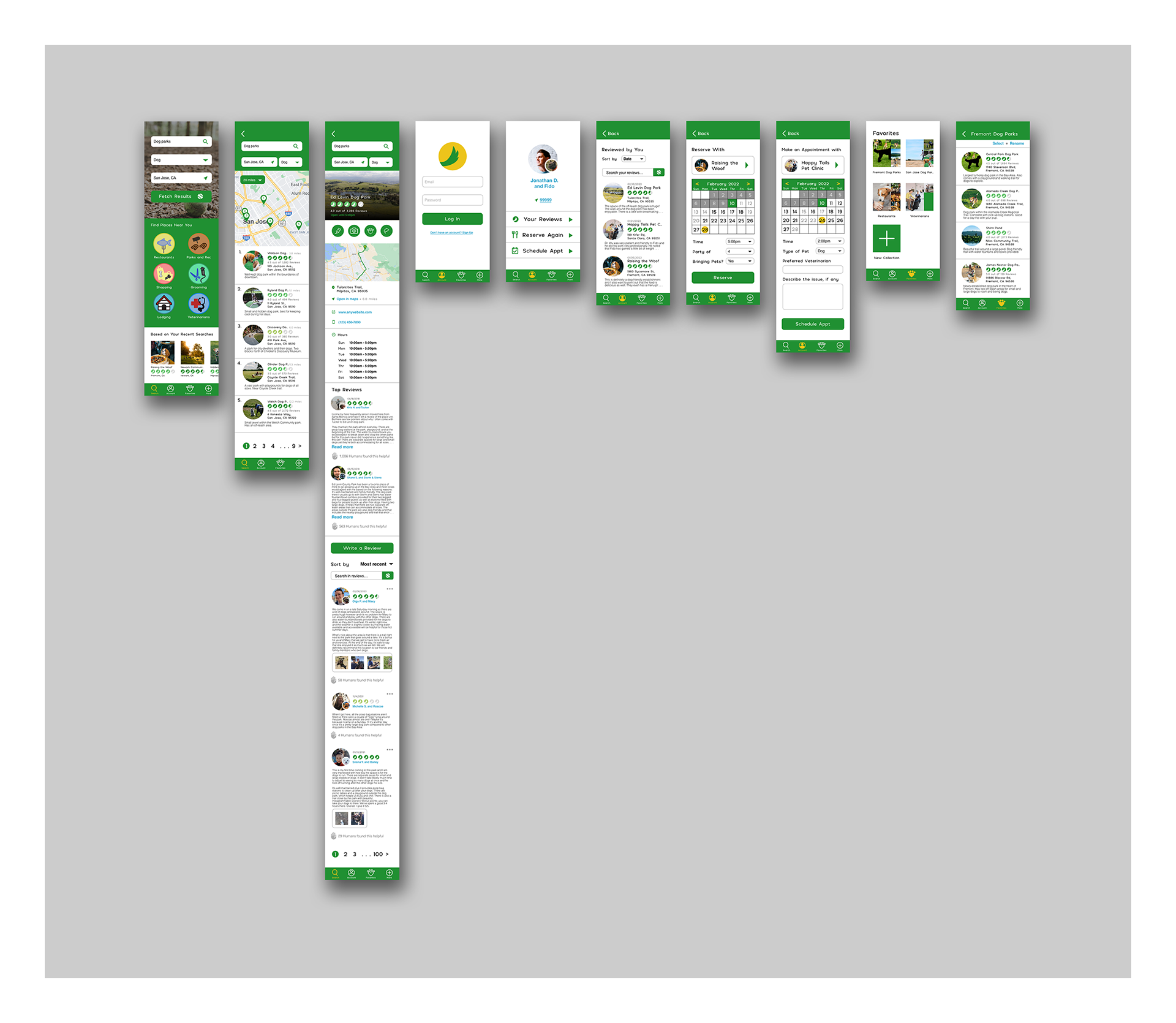
In the original home design, there is a separate area where users can select one of the animals to search. However, it would not make sense to search only under one category. It was decided that it should be added as a search criteria on the search bar. The wireframes are then further refined from the sketches.
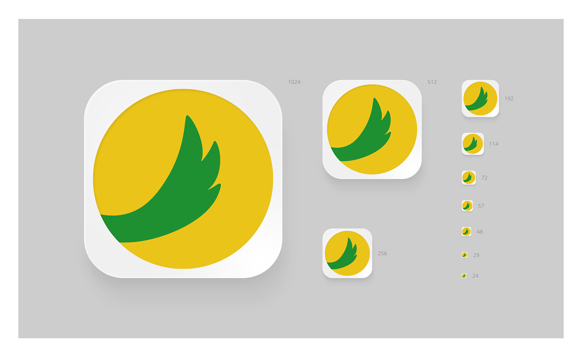
To avoid the cliche of using paws to rate a location, the logomark is used in their place. It would make sense to use it as a wagging tail is a signal that a dog is happy and can be defined to the scale of how satisfied the animal customer may be.
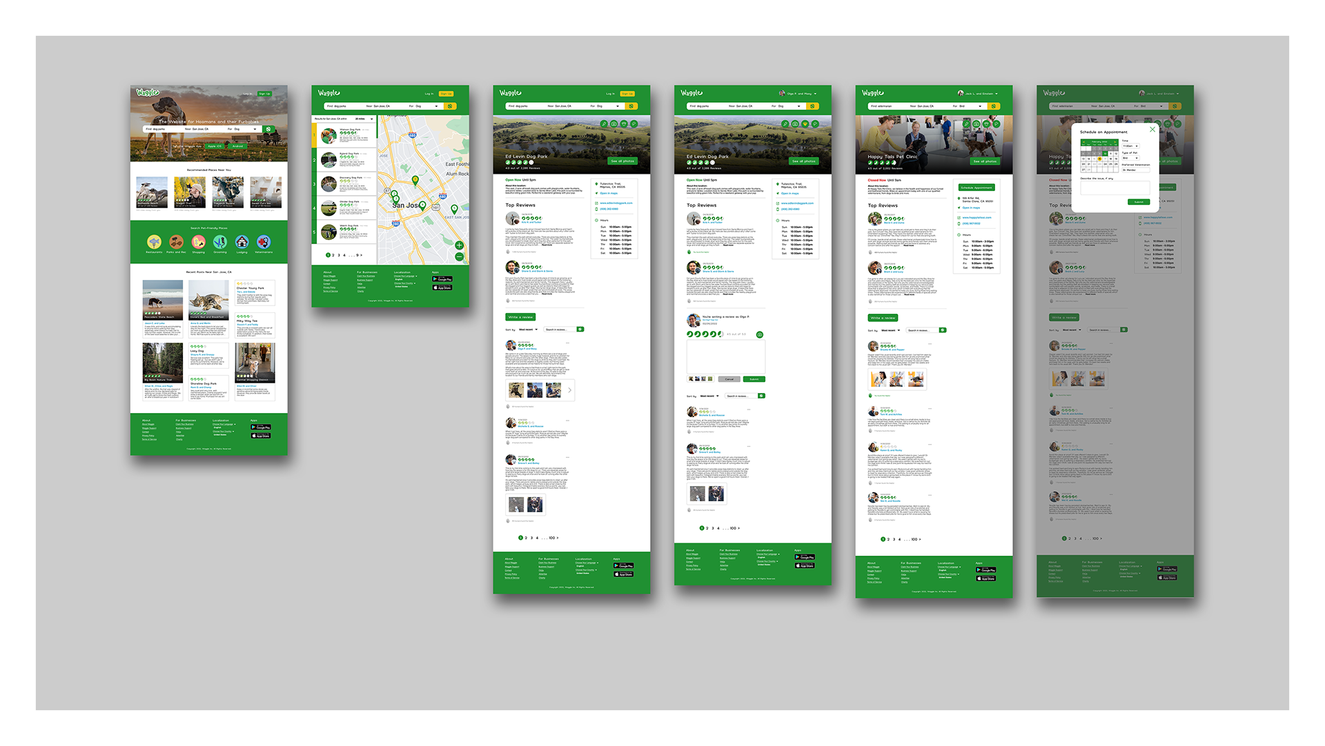
The Final Product:
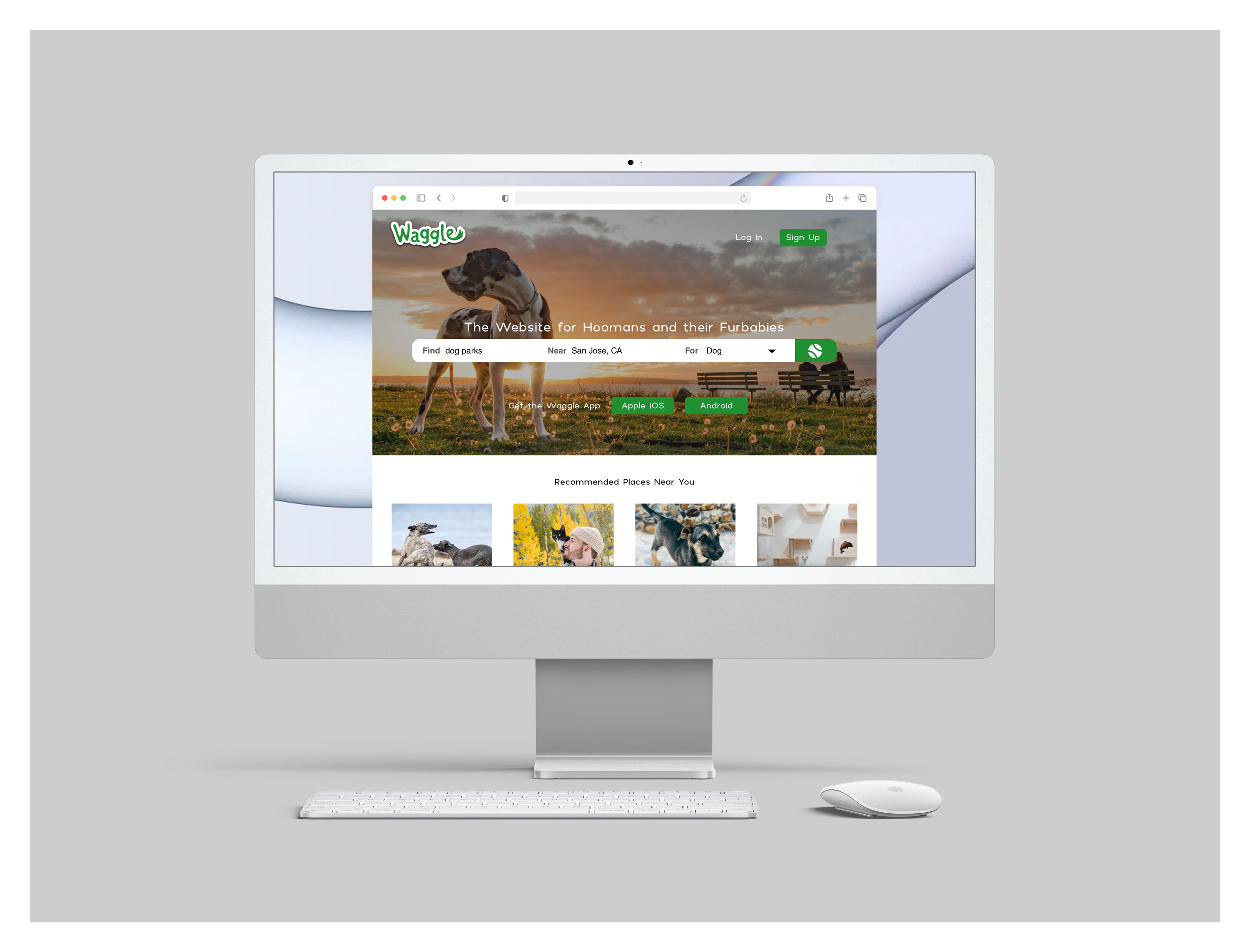
Website demonstration.
Ideation sketches of the iPhone and Android app.
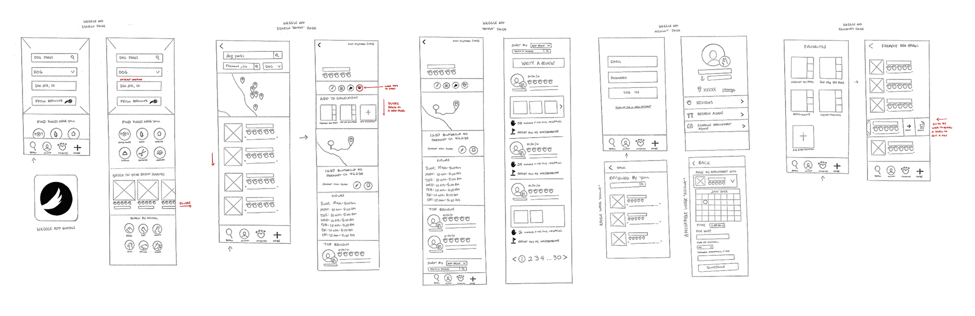
In the original sketches, some touching of the buttons would command a sliding panel (search "reviews" page - red writing) plus a swiping to move or delete things (Favorites page - red writing).
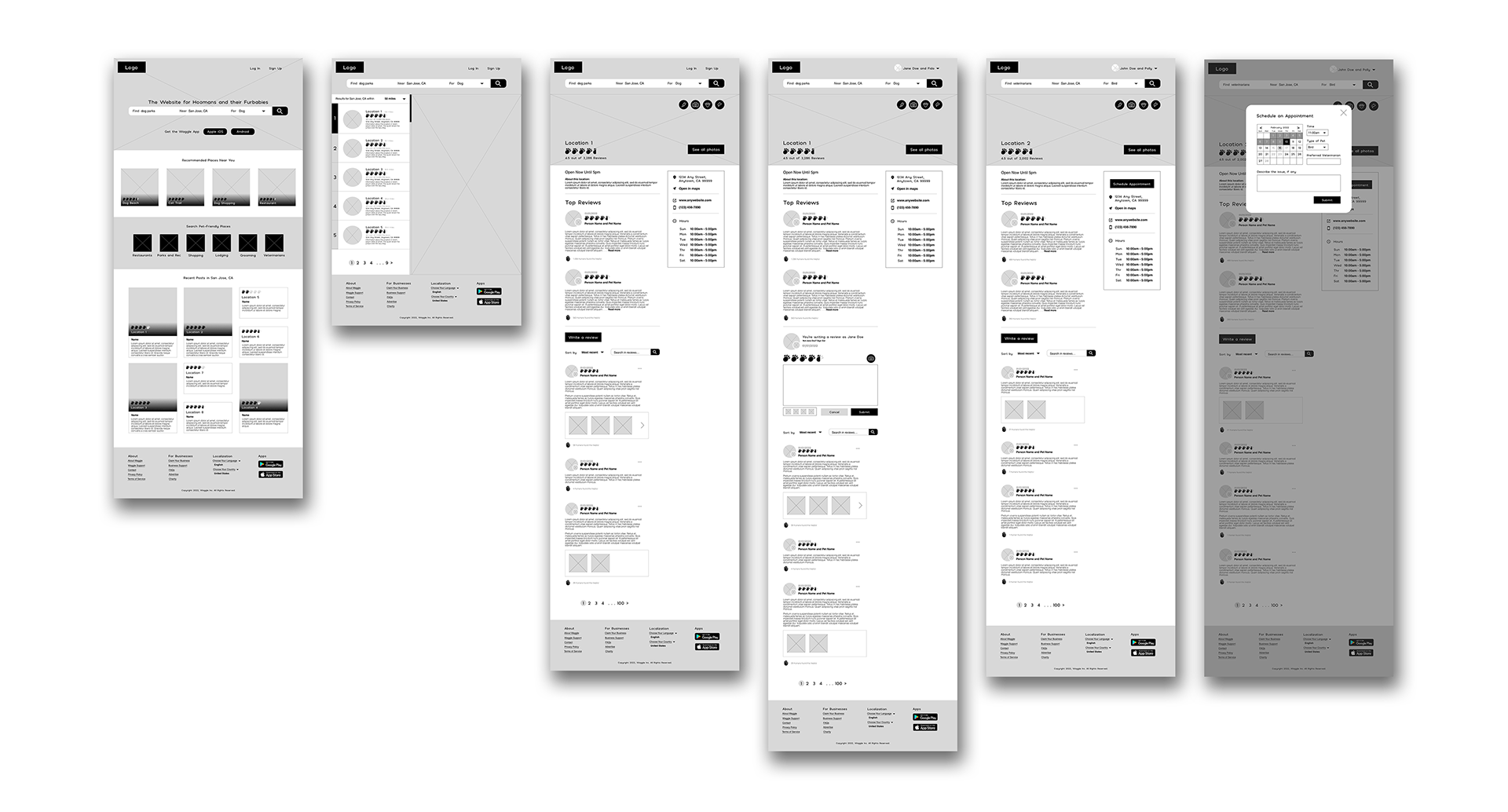
A sliding panel that opens after the button prompt may frustrate the user if they accidentally press it. What would be a best replacement for the sliding panel is to have the option be prompted by the phone itself.
A simple swiping panel to show the move and delete icons would not be obvious to the user at first use and would possibly frustrate them if they cannot find what they are looking. The solution to this would be to make the option viewable to the user at the top. They would tap "Select" at the top and checkboxes show up for them to move and delete their options - or cancel.
When those issues are remedied in the wireframes, the user will not need to second-guess the features on the app. The only challenge for the wireframes is to make sure everything is accessible and press-able with a finger or thumb, especially the calendar.
App icon for smartphones.
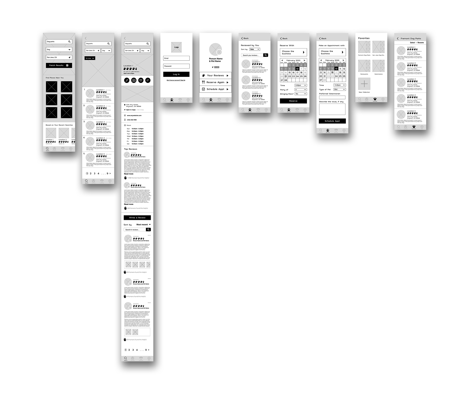
The Final Product:
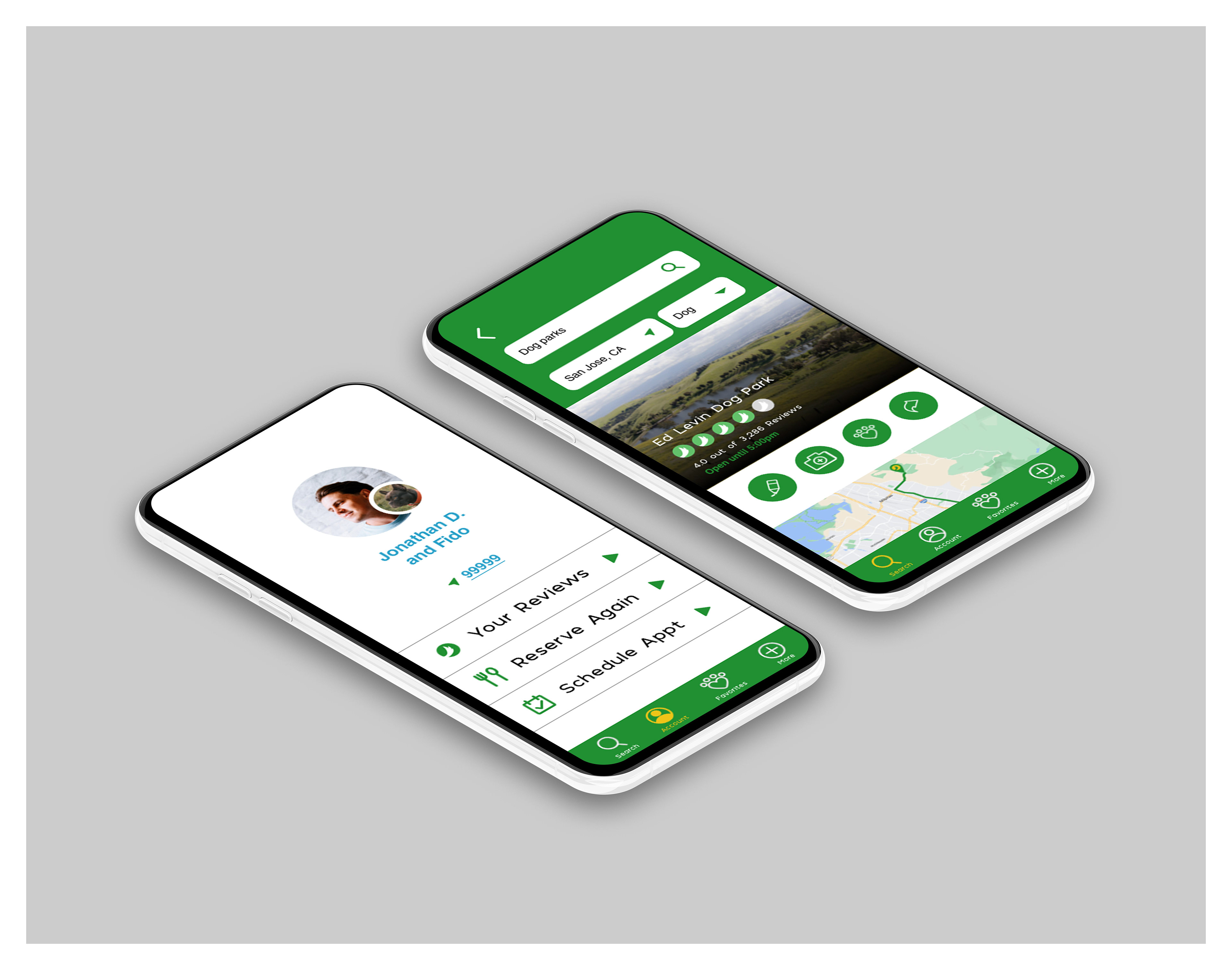
App demonstration.
Conclusion:
A project would not be successful without unique challenges, namely to figure out the theme of the website/app and avoiding cliches relating to animals. What comes out is a playful yet approachable theme that people can entrust their daily lives to.
What I have learned from the project is that a designer should provide options that are made obvious to the user. The common goal for all app-related projects is to make the user's life easier, not harder, by showing them the way and letting them find what they need.