Red Dragon is a brand of artisan hot sauce that aims to stand apart from their competitors with cluttered labels. Having a website is central to the brand awareness of a product, with intention to share information to consumers about the product's background and updates.
Research:
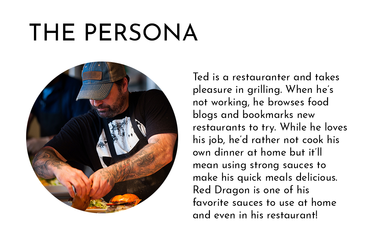
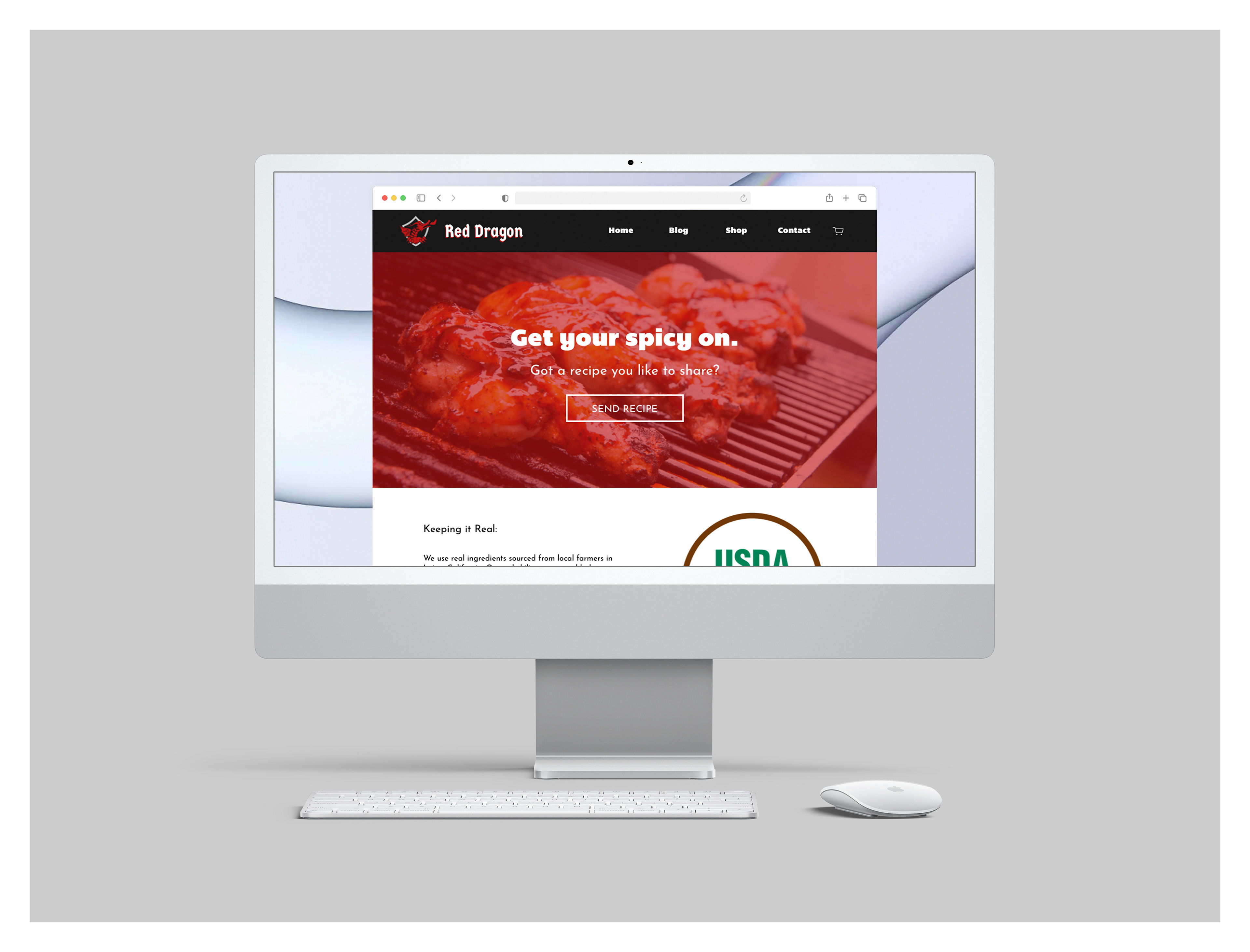
As explained, Red Dragon is a hot sauce brand, and its goal for the website is to attract devoted foodies and keep them returning.
Ideation:
From my experience being with people who are foodies, they tend to look up blogs or buy materials for cooking on their time. The idea for the website is that it will be more than a basic storefront website that shares information about the product. It will have to have a blog and e-commerce engine to keep users coming back.
I have also added a way for users to send in their recipe, and anyone who manages communication within the website can post the user's recipe in the blog.
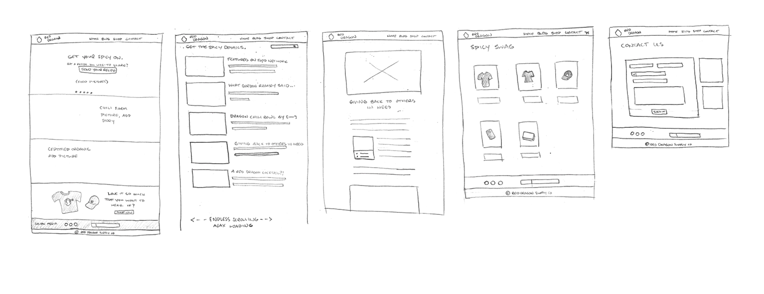
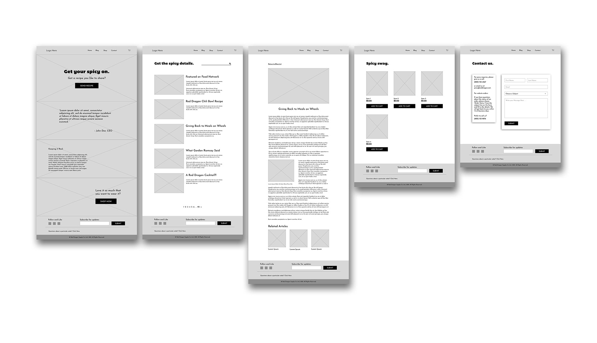
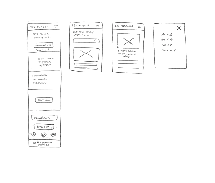
Sketches were later refined with wireframes. The original idea for the blog archive page (second after the home page) is that it will be an endless Ajax loading of various blog posts. However, from a user perspective of endless scrolling, it would be daunting to view it all at once. I have then limited to only five posts per page and had them in pagination. Of course, a search box is added to make the search easier.
To share recipes, users can directly press "Send Recipe" on the home page, and linked to the Contacts page with which they can submit their recipe on the form.
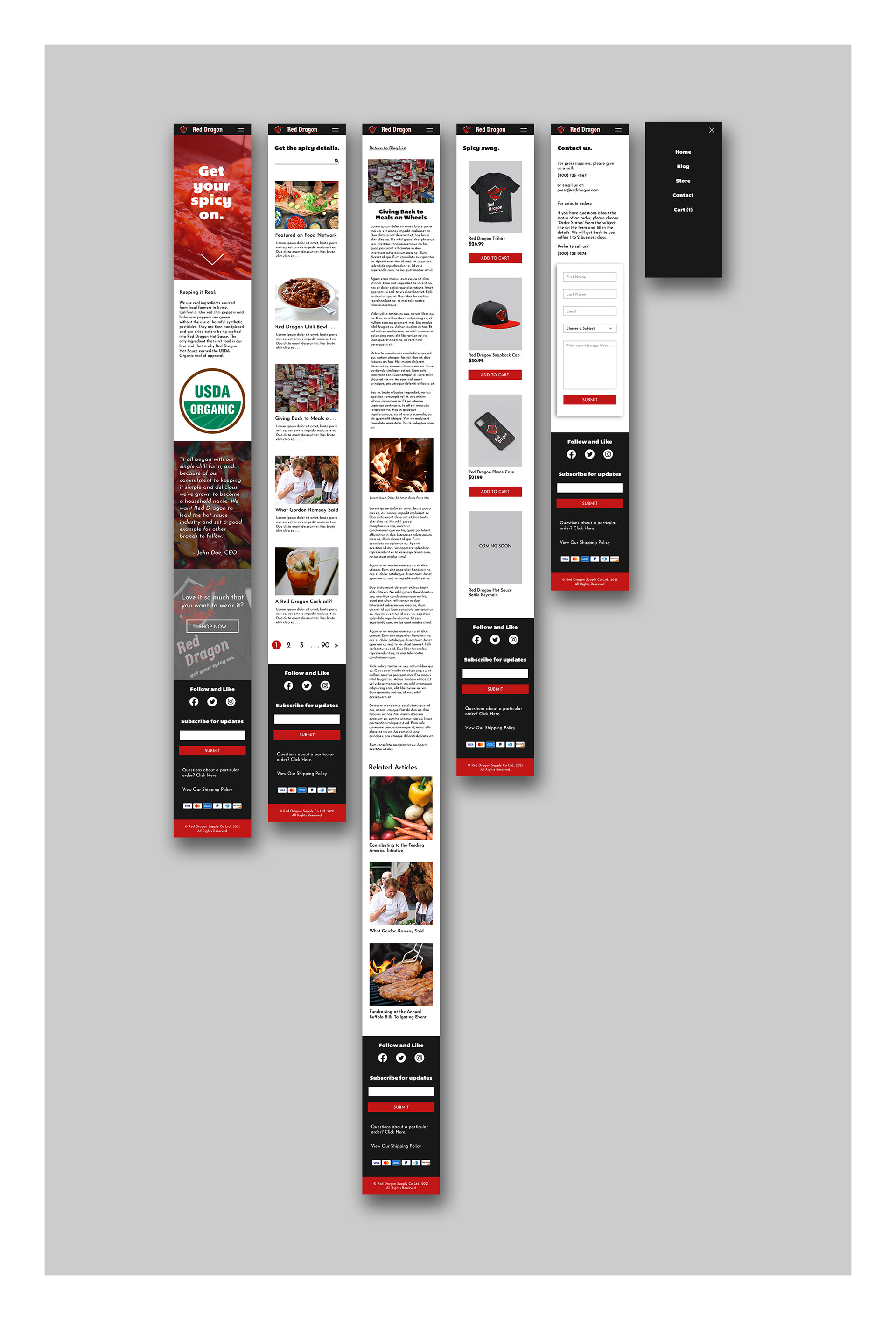
With further refining, the big difference is the arrangement of the home page sections with the Organic and Quote switched up. This is to maintain the balance of colors as the user scrolls down the home page. Additional elements were added to the footer as well.
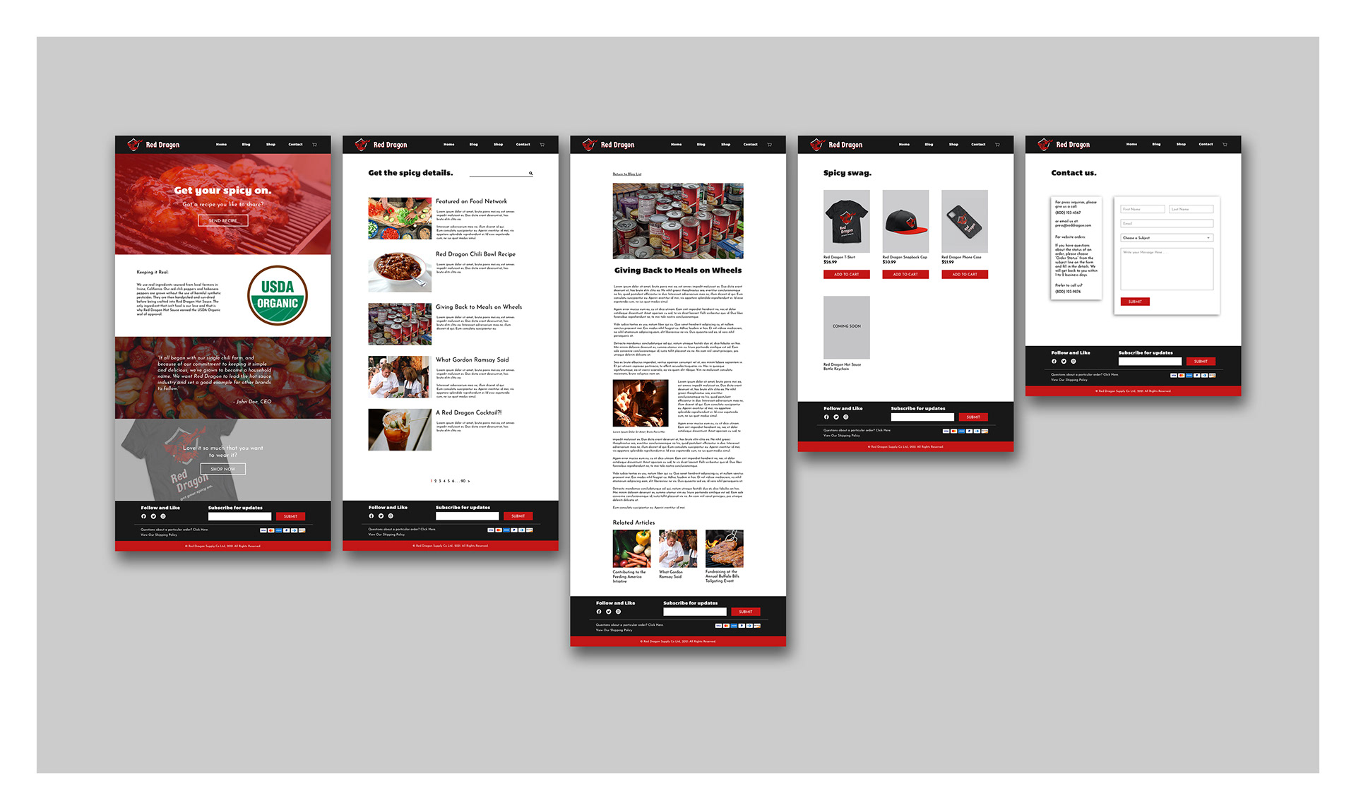
The Final Product:
Website Demonstration:
Ideation sketches of the iPhone and Android website version.
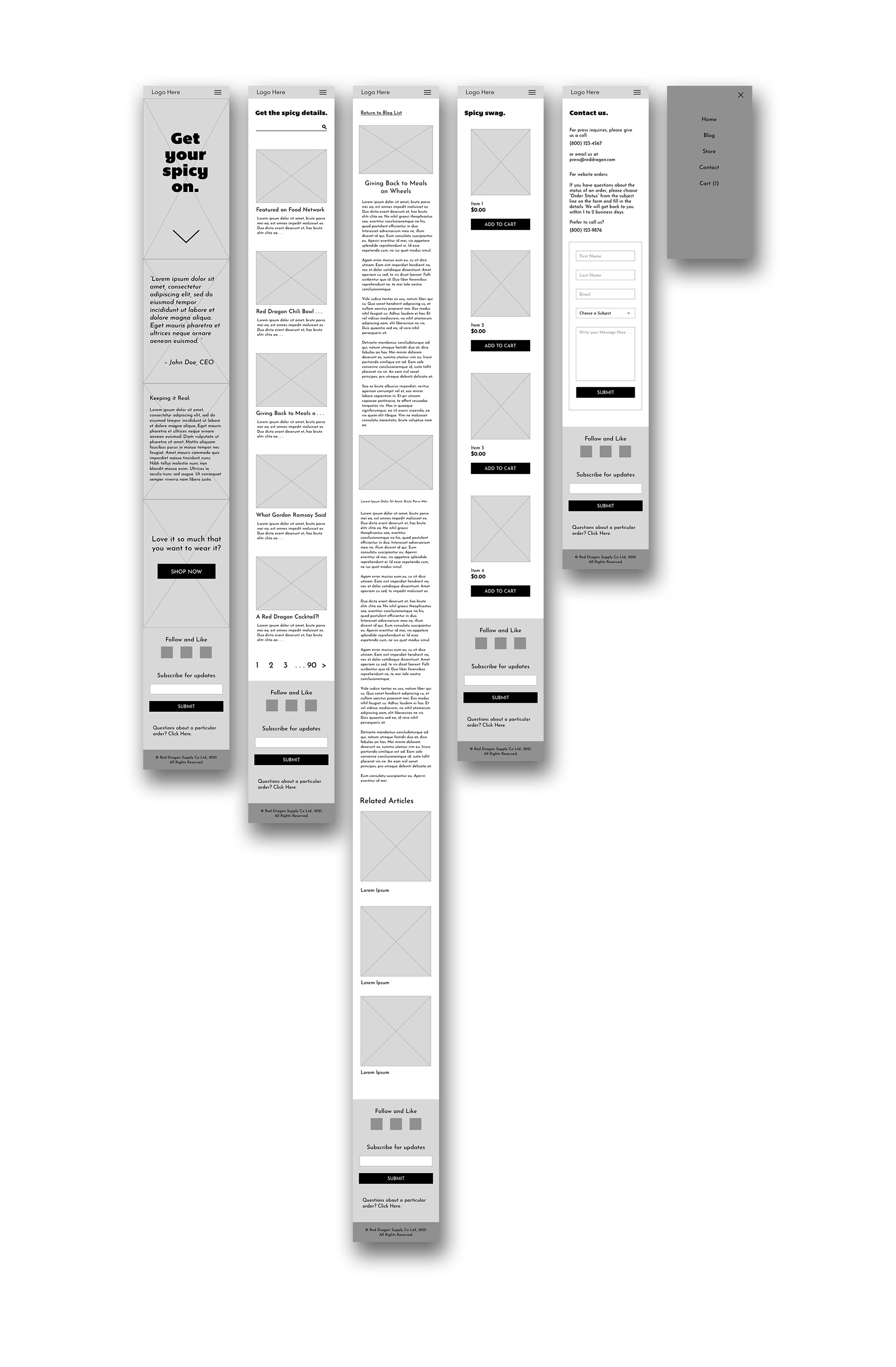
Working with the wireframes, I increased the size of the pagination and reduced the number at the bottom of the blog search results. We have fat fingers, so this is to maintain that the user don't accidentally skip past a page. A highlighted circle on the current blog results page helps to provide a view of what part of the number's area is clickable.
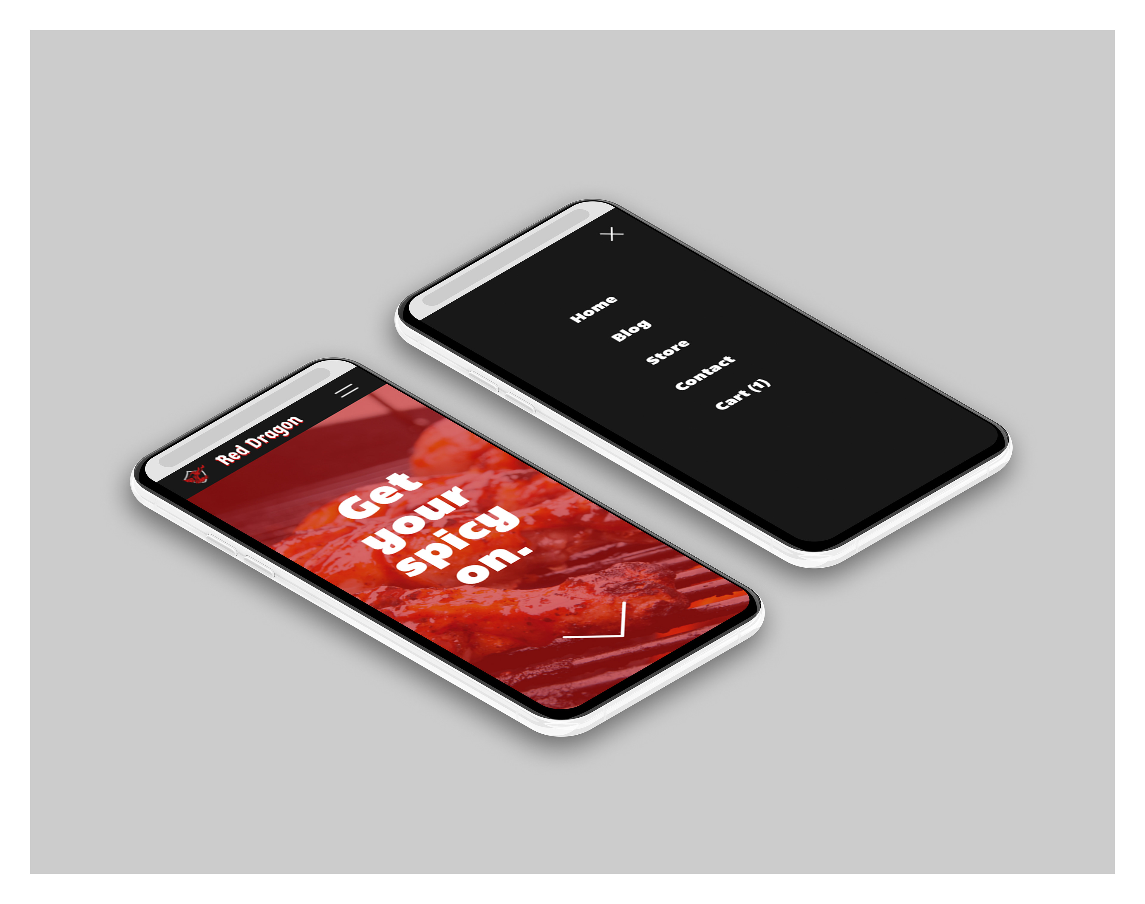
The shopping cart is in the mobile menu, accessible via the two lines.
Conclusion:
It is important to understand the user's intent as he navigates through a website, be it through a desktop or mobile website. Empathy and planning is very central to predicting the user's journey as he navigates to where he wants to be at, thus preventing further frustration.
In this work, I learned that the challenge is to maintain the appearance of the website while at the same time serving to users' needs under different device widths especially with having small elements viewable and clickable on a narrow device.